Customize User Interfaces (Optional)
Overview
As most UI configurations are primarily made from the OneTrust tenant, this section is optional. If your app has a use case where it needs to make additional configurations (e.g. font family) otherwise not available to be configured in the tenant or if it needs to control the UI configurations locally, you can use this custom configuration functionality.
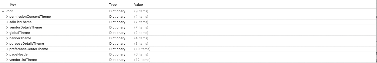
UI elements are configured through a plist supplied by OneTrust. See the Sample App for a demo.
Import the Custom UI Property List
- Download the Sample App from your tenant. Steps here.
- After unzipping the file:
- Access the OTPublishersHeadlessSDK-XCFramework
- Select your corresponding file (if tvOS, select OTPublishersHeadlessSDKtvOS. If iOS, select the other one)
- Select OTPublishersHeadlessSDK.xcframework > ios-arm64
- OTPublishersHeadlessSDK.framework > OTSDK-UIConfig-iOS.plist
tvOS will follow the same steps but with tvOS file labels.
- Copy the plist file into your app. Select 'Copy items if needed' to ensure the plist is added to the application folder hierarchy.
- Edit the UI elements in the plist as necessary.
Do not add any rows or change the keys itself in the plist. Only change the values of existing properties.
Styles set in the plist will be given priority over server values when rendering the UI if the custom config property is set.
Configure the SDK
- As part of the
UIConfiguratorprotocol, setshouldUseCustomUIConfig()totrue. - As part of the
UIConfiguratorprotocol, conform tocustomUIConfigFilePath().- While conforming to this method, provide the path to the plist.
//iOS and tvOS

//Conform to this in order to customize the UI locally
OTPublishersHeadlessSDK.shared.uiConfigurator = self

extension AppDelegate: UIConfigurator {
    func shouldUseCustomUIConfig() -> Bool {
      return true
    }

    func customUIConfigFilePath() -> String? {
      //path to plist file
      let customPath = Bundle.main.path(forResource: "OTSDK-UIConfig-iOS", ofType: "plist")
      return customPath
    }
}
Customize the UI
This section describes the UI elements that can be configured.
Table of contents:
- Customizing the Global Theme
- Customizing the Navigation Bar
- Customizing the Banner View
- Customizing the Preference Center View
- Customizing the Purpose Details View
- Customizing the Vendor List View
- Customizing the Vendor Details View
- Customizing the SDK List View
- Customizing the App Tracking Transparency Pre and Settings Prompt View
- Custom Fonts
Customizing the Global Theme
All global theme related customizations are listed under globalTheme. This is a common theme that will be applied across all UI views.
The following are the customizations available:
| UI Element | Key Name | Type | Description |
|---|---|---|---|
| Links | shouldUnderlineLink | Boolean | Underlines links or not |
| Link Color | linkColor | String | Hex code. Styles the color of the links |
Customizing Page Headers (Navigation Bar)
All page header related customizations are listed underpageHeader in the plist. This is a common theme that will be applied to all the SDK view navigation bars.
The following are the customizations available:
| UI Element | Key Name | Type | Description |
|---|---|---|---|
| Text Color | textColor | String | Hex code. Styles the color of the text |
| Font Name | fontName | String | Styles the font of the text |
| Tint Color | tintColor | String | Hex code. Styles the tint color of the page header/nav bar |
| Background Color | backgroundColor | String | Hex code. Styles the background color of the page header/nav bar |
| Font Text Style | fontTextStyle | String | Styles the text style of the font (e.g. headline, callout, sub headline, etc.). See a list of supported text styles in the table below |
| Font Size | fontSize | Int | Styles the size of the font |
| Font Text Style Options |
|---|
largeTitle |
title1 |
title2 |
title3 |
headline |
subheadline |
body |
callout |
footnote |
caption1 |
caption2 |
When a custom
fontNameis provided, at least one of thefontSizeorfontTextStyleshould also be provided in order for it to reflect.In order for dynamic font sizes to be supported, the application will have to provide a valid value for
fontTextStyleif customizing the fonts.
Customizing the Banner UI
All banner view related customizations are listed under bannerTheme in the plist.
The following are the customizations available for the Banner View:
| UI Element | Key Name | Type | Description |
|---|---|---|---|
| Links | Top level: linkspolicyLinkvendorList | Dictionary | Styles the Privacy Policy or Vendors List link |
| Background Color | backgroundColor | String | Styles the background color of the banner view |
| Buttons | Top level: buttonscloseButtonacceptAllrejectAllshowPreferences | Dictionary | Styles the close ('x'), accept all, reject all, and manage settings CTAs |
| Summary | Top level: summarytitledescription | Dictionary | Styles the title and description text of the banner view |
Here's a list of possible UI styles that can be changed under each applicable element above:
| UI Element | Key Name | Type | Description |
|---|---|---|---|
| Text Color | textColor | String | Hex code. Styles the color of the text |
| Font Name | fontName | String | Styles the font of the text |
| Text Alignment | textAlignment | String | Styles the alignment of the text |
| Tint Color | tintColor | String | Hex code. Styles the tint color of the page |
| Font Text Style | fontTextStyle | String | Styles the text style of the font (e.g. headline, callout, sub headline, etc.). See a list of supported text styles in the table below |
| Font Size | fontSize | Int | Styles the size of the font |
| Border Radius | borderRadius | String | Styles the border radius of the CTA |
| Border Width | borderWidth | String | Styles the border width of the CTA |
| Border Color | borderColor | String | Styles the border color of the CTA |
| Font Text Style Options |
|---|
largeTitle |
title1 |
title2 |
title3 |
headline |
subheadline |
body |
callout |
footnote |
caption1 |
caption2 |
When a custom
fontNameis provided, at least one of thefontSizeorfontTextStyleshould also be provided in order for it to reflect.In order for dynamic font sizes to be supported, the application will have to provide a valid value for
fontTextStyleif customizing the fonts.
Customizing the Preference Center UI
All preference center view related customizations are listed under preferenceCenterTheme in the plist.
The following customizations are available for the Preference Center View:
| UI Element | Key Name | Type | Description |
|---|---|---|---|
| Summary | Top level: summarytitledescription | Dictionary | Styles the text of the title and description |
| Buttons | Top level: buttonsacceptAllrejectAllconfirmMyChoicecloseButton | Dictionary | Styles the accept, reject, close, and confirm choices CTAs |
| Purposes Always Active Status | purposesAlwaysActiveStatus | Dictionary | Styles the always active text of the strictly necessary categories |
| Purpose Title | purposeTitle | Dictionary | Styles the text of the OneTrust categories/IAB purposes |
| Show Logo on PC | showLogoOnPC | Boolean | Display/not display a logo |
| Links | Top level: linkspolicyLinkvendorList | Dictionary | Styles the Privacy Policy or Vendor List link |
| Right Chevron Color | rightChevronColor | String | Hex code. Styles the color of the chevron or 'arrow' to the right of each category/purpose |
| Line Break Color | lineBreakColor | String | Hex code. Styles the lines separating each category/purpose (if enabled) |
| Toggle Color | toggleColor | String | Hex code. Styles the toggle color when toggled ON |
| Background Color | backgroundColor | String | Hex code. Styles the background color of the preference center view |
Here's a list of possible UI styles that can be changed under each applicable element above:
| UI Element | Key Name | Type | Description |
|---|---|---|---|
| Text Color | textColor | String | Hex code. Styles the color of the text |
| Font Name | fontName | String | Styles the font of the text |
| Text Alignment | textAlignment | String | Styles the alignment of the text |
| Tint Color | tintColor | String | Hex code. Styles the tint color of the page |
| Font Text Style | fontTextStyle | String | Styles the text style of the font (e.g. headline, callout, sub headline, etc.). See a list of supported text styles in the table below |
| Font Size | fontSize | Int | Styles the size of the font |
| Border Radius | borderRadius | String | Styles the border radius of the CTA |
| Border Width | borderWidth | String | Styles the border width of the CTA |
| Border Color | borderColor | String | Styles the border color of the CTA |
| Font Text Style Options |
|---|
largeTitle |
title1 |
title2 |
title3 |
headline |
subheadline |
body |
callout |
footnote |
caption1 |
caption2 |
When a custom
fontNameis provided, at least one of thefontSizeorfontTextStyleshould also be provided in order for it to reflect.In order for dynamic font sizes to be supported, the application will have to provide a valid value for
fontTextStyleif customizing the fonts.
Customizing the Purposes Details UI
All purpose detail view related customizations are listed under purposeDetailsTheme in the plist.
The following customizations are available for the Purpose Details View:
| UI Element | Key Name | Type | Description |
|---|---|---|---|
| Group Summary | Top level: groupSummarytitledescription | Dictionary | Styles the title and description |
| Always Active Status | alwaysActiveStatus | Dictionary | Styles the 'always active' text of purposes that cannot be disabled |
| Consent Title | consentTitle | Dictionary | Styles the 'Consent' toggle title for IAB purposes |
| Legitimate Interest Title | legitInterestTitle | Dictionary | Styles the 'Legitimate Interest' toggle title for IAB purposes |
| Links | Top level: linkssdkListvendorListfullLegalText | Dictionary | Styles the SDK List, Vendor List, and View Illustrations link |
| Line Break Color | lineBreakColor | String | Hex code. Styles the lines separating each category/purpose (if enabled) |
| Background Color | backgroundColor | String | Hex code. Styles the background color of the purpose details view |
| Toggle Color | toggleColor | String | Hex code. Styles the toggle color when toggled ON |
Here's a list of possible UI styles that can be changed under each applicable element above:
| UI Element | Key Name | Type | Description |
|---|---|---|---|
| Text Color | textColor | String | Hex code. Styles the color of the text |
| Font Name | fontName | String | Styles the font of the text |
| Text Alignment | textAlignment | String | Styles the alignment of the text |
| Tint Color | tintColor | String | Hex code. Styles the tint color of the page |
| Font Text Style | fontTextStyle | String | Styles the text style of the font (e.g. headline, callout, sub headline, etc.). See a list of supported text styles in the table below |
| Font Size | fontSize | Int | Styles the size of the font |
| Font Text Style Options |
|---|
largeTitle |
title1 |
title2 |
title3 |
headline |
subheadline |
body |
callout |
footnote |
caption1 |
caption2 |
When a custom
fontNameis provided, at least one of thefontSizeorfontTextStyleshould also be provided in order for it to reflect.In order for dynamic font sizes to be supported, the application will have to provide a valid value for
fontTextStyleif customizing the fonts.
Customizing the Vendor List UI
All vendor list view related customizations are listed under vendorListTheme in the plist.
The following customizations are available for the Vendor List View:
| UI Element | Key Name | Type | Description |
|---|---|---|---|
| Line Break Color | lineBreakColor | String | Hex code. Styles the lines separating each vendor (if enabled) |
| Filter Item Title | filterItemTitle | Dictionary | Styles the titles available in the filter list |
| Background Color | backgroundColor | String | Hex code. Styles the background color of the vendor list view |
| Filter Off Color | filterOffColor | String | Hex code. Styles the filter color when no filter is applied |
| Buttons | Top level: buttonsconfirmMyChoicesapplyFilter | Dictionary | Styles the apply and confirm choices CTAs of the vendor list |
| Filter On Color | filterOnColor | String | Hex code. Styles the filter icon color when filter is applied |
| Filter Selection Color | filterSelectionColor | String | Hex code. Styles the tint color of the check mark in the vendor filter list |
| Toggle Color | toggleColor | String | Hex code. Styles the vendor list toggle color when toggled ON |
| Title | title | Dictionary | Styles the navigation tab bar titles and titles of each vendor in the vendor list |
| Filter Navigation Text | filterNavText | Dictionary | Styles the 'cancel' CTA of the filter list in the vendor list UI |
| Right Chevron Color | rightChevronColor | String | Hex code. Styles the color of the chevron or 'arrow' to the right of each vendor |
| Search Bar | searchBar | Dictionary | Styles the search bar section of the vendor list view |
Here's a list of possible UI styles that can be changed under each applicable element above:
| UI Element | Key Name | Type | Description |
|---|---|---|---|
| Text Color | textColor | String | Hex code. Styles the color of the text |
| Font Name | fontName | String | Styles the font of the text |
| Text Alignment | textAlignment | String | Styles the alignment of the text |
| Tint Color | tintColor | String | Hex code. Styles the tint color of the page |
| Font Text Style | fontTextStyle | String | Styles the text style of the font (e.g. headline, callout, sub headline, etc.). See a list of supported text styles in the table below |
| Font Size | fontSize | Int | Styles the size of the font |
| Border Radius | borderRadius | String | Styles the border radius of the CTA |
| Border Width | borderWidth | String | Styles the border width of the CTA |
| Border Color | borderColor | String | Styles the border color of the CTA |
| Font Text Style Options |
|---|
largeTitle |
title1 |
title2 |
title3 |
headline |
subheadline |
body |
callout |
footnote |
caption1 |
caption2 |
When a custom
fontNameis provided, at least one of thefontSizeorfontTextStyleshould also be provided in order for it to reflect.In order for dynamic font sizes to be supported, the application will have to provide a valid value for
fontTextStyleif customizing the fonts.
Customizing the Vendor Details UI
All vendor list view related customizations are listed under vendorDetailsTheme in the plist.
The following UI Elements are the customizations available for the Vendor Details View:
| UI Element | Key Name | Type | Description |
|---|---|---|---|
| Consent Title | consentTitle | Dictionary | Styles the title of the 'consent' label |
| Details Summary | Top level: detailsSummarytitledescription | Dictionary | Styles the title and description of the vendor details |
| Legitimate Interest Title | legitInterestTitle | Dictionary | Styles the 'legitimate interest' label |
| Links | Top level: linksprivacyNotice | Dictionary | Styles the privacy notice link of the vendor |
| Title | title | Dictionary | Styles the title of the vendor details page |
| Background Color | backgroundColor | String | Hex code. Styles the background color of the vendor details UI page |
| Toggle Color | toggleColor | String | Hex code. Styles the vendor details UI toggle color when toggled ON |
Here's a list of possible UI styles that can be changed under each applicable element above:
| UI Element | Key Name | Type | Description |
|---|---|---|---|
| Text Color | textColor | String | Hex code. Styles the color of the text |
| Font Name | fontName | String | Styles the font of the text |
| Text Alignment | textAlignment | String | Styles the alignment of the text |
| Tint Color | tintColor | String | Hex code. Styles the tint color of the page |
| Font Text Style | fontTextStyle | String | Styles the text style of the font (e.g. headline, callout, sub headline, etc.). See a list of supported text styles in the table below |
| Font Size | fontSize | Int | Styles the size of the font |
| Border Radius | borderRadius | String | Styles the border radius of the CTA |
| Border Width | borderWidth | String | Styles the border width of the CTA |
| Border Color | borderColor | String | Styles the border color of the CTA |
| Font Text Style Options |
|---|
largeTitle |
title1 |
title2 |
title3 |
headline |
subheadline |
body |
callout |
footnote |
caption1 |
caption2 |
When a custom
fontNameis provided, at least one of thefontSizeorfontTextStyleshould also be provided in order for it to reflect.In order for dynamic font sizes to be supported, the application will have to provide a valid value for
fontTextStyleif customizing the fonts.
Customizing the SDK List UI
All SDK List view related customizations are listed under sdkListTheme in the plist.
The following UI Elements are the customizations available for the SDK List View:
| UI Element | Key Name | Type | Description |
|---|---|---|---|
| Summary | Top level: summarytitledescription | Dictionary | Styles the title and description of the SDK List view |
| Search Bar | searchBar | Dictionary | Styles the search bar field of the SDK List view |
| Filter OFF Color | filterOffColor | String | Hex code. Styles the filter element when filters are not in use |
| Filter ON Color | filterOnColor | String | Hex code. Styles the filter element when filters are in use |
| Filter List | Top level: filterListsdkItembuttonsnavItemselectionColor | Dictionary | Styles the elements in the filter list |
| Line Break Color | lineBreakColor | String | Hex code. Styles the lines separating each filter list item |
| Background Color | backgroundColor | String | Hex code. Styles the background color of the filter list |
Here's a list of possible UI styles that can be changed under each applicable element above:
| UI Element | Key Name | Type | Description |
|---|---|---|---|
| Text Color | textColor | String | Hex code. Styles the color of the text |
| Font Name | fontName | String | Styles the font of the text |
| Text Alignment | textAlignment | String | Styles the alignment of the text |
| Tint Color | tintColor | String | Hex code. Styles the tint color of the page |
| Font Text Style | fontTextStyle | String | Styles the text style of the font (e.g. headline, callout, sub headline, etc.). See a list of supported text styles in the table below |
| Font Size | fontSize | Int | Styles the size of the font |
| Border Radius | borderRadius | String | Styles the border radius of the CTA |
| Border Width | borderWidth | String | Styles the border width of the CTA |
| Border Color | borderColor | String | Styles the border color of the CTA |
| Font Text Style Options |
|---|
largeTitle |
title1 |
title2 |
title3 |
headline |
subheadline |
body |
callout |
footnote |
caption1 |
caption2 |
When a custom
fontNameis provided, at least one of thefontSizeorfontTextStyleshould also be provided in order for it to reflect.In order for dynamic font sizes to be supported, the application will have to provide a valid value for
fontTextStyleif customizing the fonts.
Customizing the App Tracking Transparency Pre and Settings Prompt
All ATT pre and settings prompt view related customizations are listed under permissionConsentTheme in the plist.
The following UI Elements are the customizations available for the ATT Prompt View:
| UI Element | Key Name | Type | Description |
|---|---|---|---|
| Buttons | Top level: buttonsThemecancelConsentgiveConsent | Dictionary | Styles the CTAs of the pre and settings prompt. In the settings prompt, giveConsent styles the 'Settings' CTA and cancelConsent styles the 'Not Now' CTA |
| Background Color | backgroundColor | String | Hex code. Styles the background color of the pre and settings prompt |
| Title and Description Styles | Top level: consentSummaryThemetitledescription | Dictionary | Styles the title and description of the pre and settings prompt |
| Title and Description Content | Top level: idfaConsentViewTextgiveConsentModechangeConsentMode | Dictionary | Updates the text/content of the pre and settings prompt. giveConsentMode refers to the pre prompt and changeConsentMode refers to the settings prompt |
Here's a list of possible UI styles that can be changed under each applicable element above:
| UI Element | Key Name | Type | Description |
|---|---|---|---|
| Text Color | textColor | String | Hex code. Styles the color of the text |
| Font Name | fontName | String | Styles the font of the text |
| Text Alignment | textAlignment | String | Styles the alignment of the text |
| Tint Color | tintColor | String | Hex code. Styles the tint color of the page |
| Font Text Style | fontTextStyle | String | Styles the text style of the font (e.g. headline, callout, sub headline, etc.). See a list of supported text styles in the table below |
| Font Size | fontSize | Int | Styles the size of the font |
| Border Radius | borderRadius | String | Styles the border radius of the CTA |
| Border Width | borderWidth | String | Styles the border width of the CTA |
| Border Color | borderColor | String | Styles the border color of the CTA |
| Font Text Style Options |
|---|
largeTitle |
title1 |
title2 |
title3 |
headline |
subheadline |
body |
callout |
footnote |
caption1 |
caption2 |
When a custom
fontNameis provided, at least one of thefontSizeorfontTextStyleshould also be provided in order for it to reflect.In order for dynamic font sizes to be supported, the application will have to provide a valid value for
fontTextStyleif customizing the fonts.
Custom Fonts
To change the font:
For more information, see Apple's official documentation Adding a Custom Font to Your App.
- Add custom fonts to Xcode (if custom).
- Reference the font in the
fontNamekey of the plist. Ensure you specify afontSizefor the custom font to take effect.
Updated 7 months ago